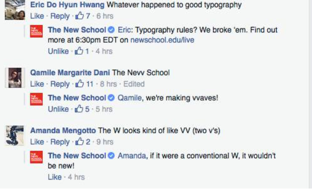
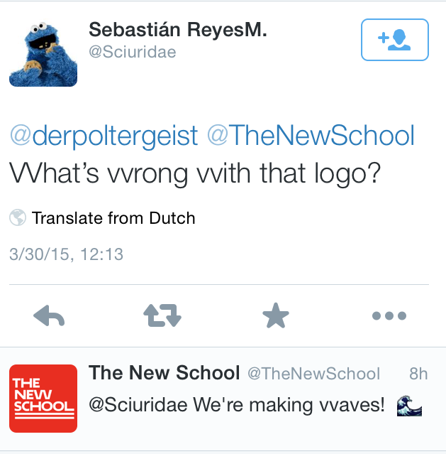
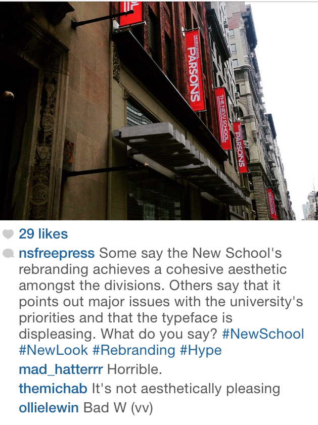
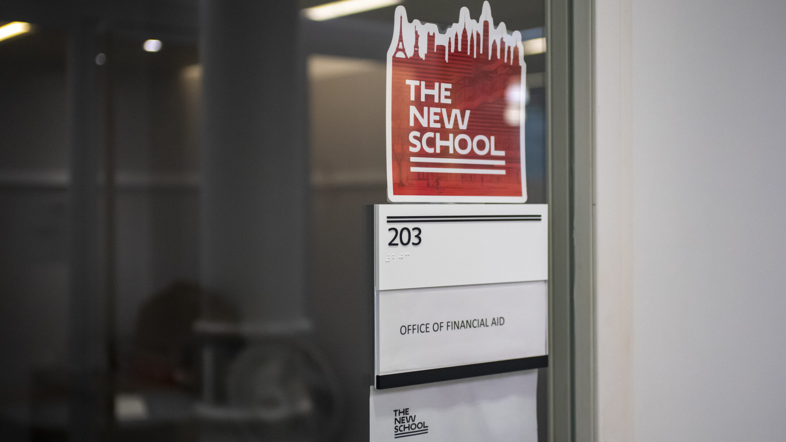
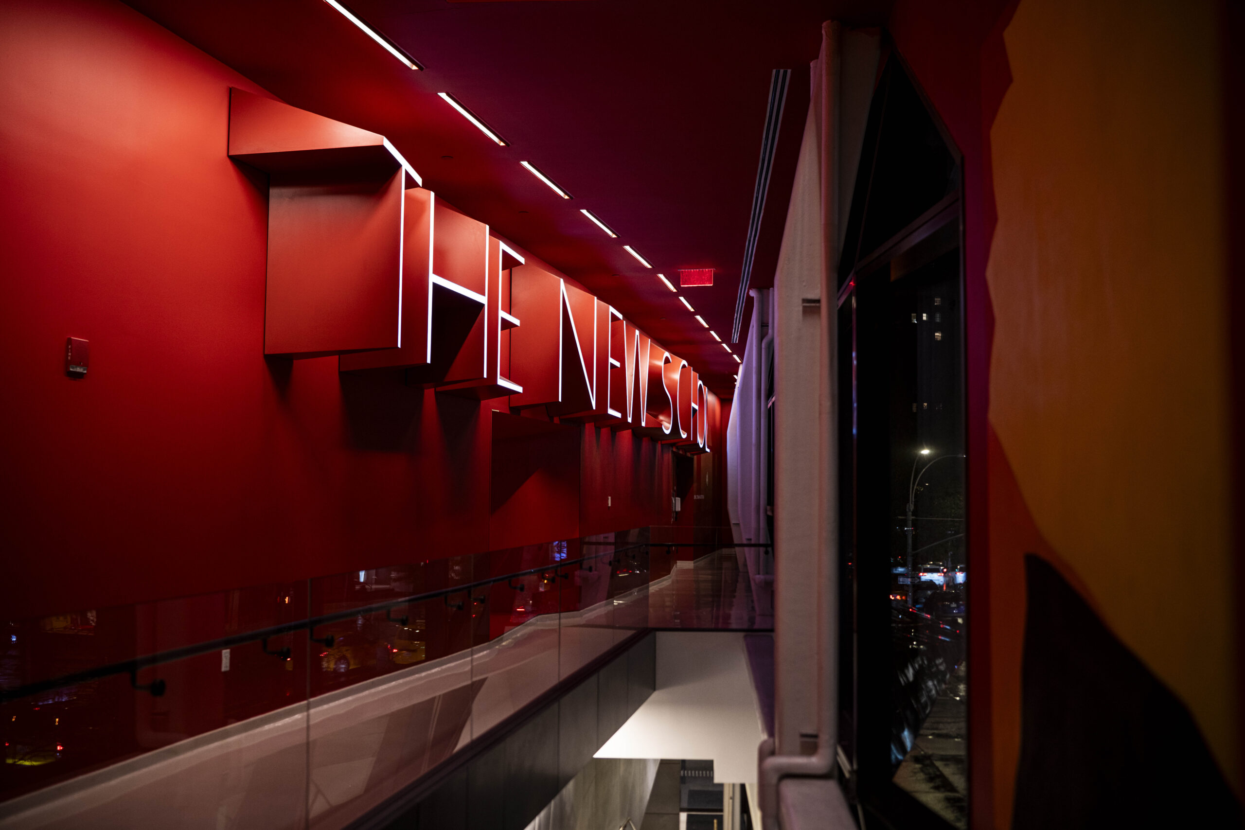
The New School unveiled its rebranding initiative today, which featured a new font designed by Pentagram, an independent design consulting firm. The algorithm-based font, called Neue, was showcased on large red flags on the sides of university buildings and on the water towers atop them. The wide letters bothered some students, especially the “w,” which when stretched out, looks like two v’s.
“I can’t stand the W, the W pisses me off like no other,” Allen Robbins an Illustrations major at Parsons said.
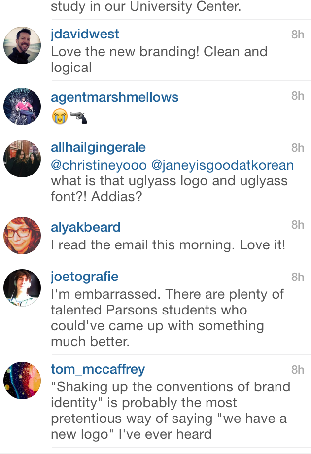
Other students took their complaints to social media, posting on the New School’s Instagram photo of the new logo and tweeting at The New School.
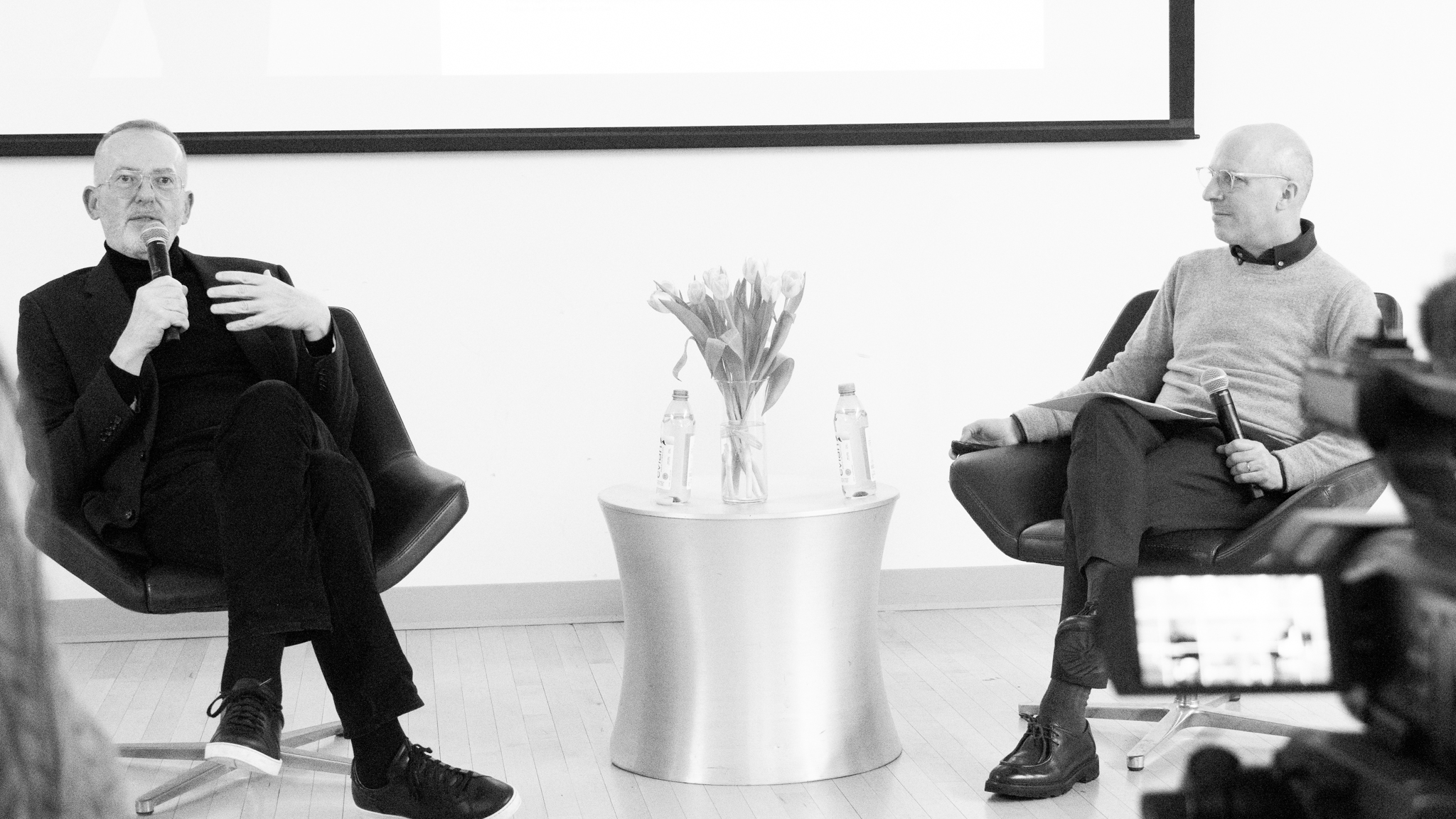
The now infamous W was mentioned at a talk in the University Center with lead-designer Paula Scher moderated by Parsons dean Joel Towers.
“Nevv is the new new,” Scher said.
Tamar is a poet, writer, New York-lover and dweller. She studies jounalism+design at The New School.





Leave a Reply