New School students were surprised to find the University Center cafeteria redesigned when they lined up eager to receive a free meal as part of the administration’s welcome to the spring semester last week. The university decided to renovate the dining hall over winter break, leaving some students confused and unhappy with the changes.
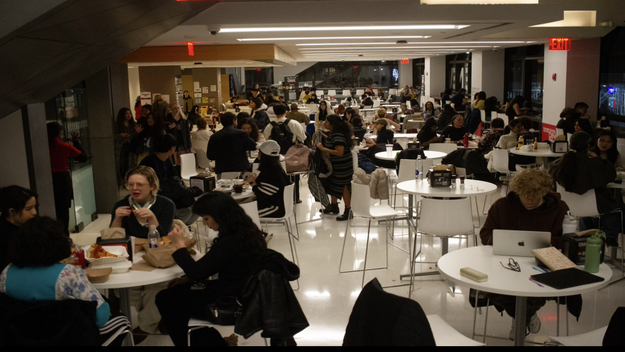
To kick off the spring semester, courtesy of the Office of the President, the university hosted a week-long “Bites and Beats” event, offering an hour of free dining accompanied by live music in the newly renovated dining hall. Perhaps the most significant alterations were that the once vibrant, Parsons red hallway leading to the cafeteria had been whitewashed, and the space in the dining hall formerly occupied by more intimate concrete booths had been replaced with many bar-style seats and tables.
The changes were met with negative reactions from staff and students. Ava Lowe, a freshman at the College of Performing Arts, reminisced about the comfortability of the old layout. “I liked the fact that you could sit in one of the corner booths and hide and not feel like anyone is judging you while you’re eating,” she said.
Lowe was also unhappy to see university resources going to this redesign since she believes there are much bigger issues to be addressed in other campus buildings. Lowe, who spends most of her class time in Arnold Hall on W 13th Street, described issues students have been dealing with there. “All of our classrooms are falling apart. Our windows are literally being held together with duct tape,” she said.
Aidan Clarkson-Ferrel, a senior at Eugene Lang College of Liberal Arts, said, “there were creature comforts with the original floor plan, particularly the fact that there were plugs for your electronics on the benches” — a feature noticeably missing from the renovated cafeteria. He added that the new layout “somehow feels more cramped because every inch is a table.”
Alex Inglis, a junior at Lang, also agreed that the new layout wasn’t a happy surprise. “[The old layout] definitely felt a little more comfortable,” Inglis said. But even though he feels more exposed when dining, he said the redesign wasn’t entirely a poor change.“It’s a lot easier to find a seat now,” he said.
Cafeteria employee Jada Graham shared the same disdain for the cafeteria’s makeover. She said the concrete booth served as “an intimate corner that students needed to study.” Graham also critiqued the new color scheme, saying the previous red paint was more vibrant and welcoming. “It gave you a sense of energy to come in as to where right now it was like we’re gonna be in hospital. It gives me anxiety. I don’t like it at all,” she said.
All three students unanimously agreed that they preferred the cafeteria they left in December. They also said they wished that the funding allocated for the renovation had been used to make other improvements on campus, such as fixing elevator issues in the Social Research building on 16th Street or repairs to Arnold Hall.





Leave a Reply