Paul Rudolph was an iconic American architect, known for his use of reinforced concrete and complex floor plans which set the stage for modern architecture in the late 20th and 21st centuries. Though his buildings aren’t outright flashy, he left a legacy of practicality and ethical design, and his work reflected the inherent creativity in modern architecture.
The Paul Rudolph Institute, located on the second floor of the Modulightor building on East 58th St, was Rudolph’s home from 1996 until his death a year later. Living in this commercial building of his own design, Rudolph’s devotion to his craft is evident. He straddled modernism and intricacy in the Modulightor building by using objects and furnishings in unintended ways — staircases became shelves and railings became windows. The institute opened to the public for tours and volunteering opportunities in 2010.
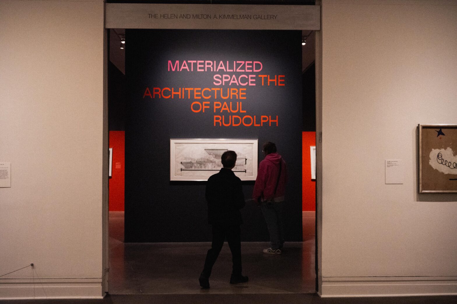
In an effort to revisit Rudolph’s characterized cocktail of modernism and creativity in architecture, the Metropolitan Museum of Art (MET) is showcasing the works of Rudolph in a temporary exhibition that debuted on Aug. 27 and will remain open until Mar. 16, 2025.
The exhibition space hopes to emulate the essence of Rudolph, but it falls short. Rudolph loved brightly lit environments, variable floor heights, and maximizing thresholds. His floor plans fit together like puzzle pieces and are often connected in many places through winding staircases that not only provide a way to go from floor to floor, but also a threshold and aperture to look at fellow dwellers. In clear opposition, the MET’s exhibit is displayed in a bare room with dim lighting and walls that close off any shared space, making the exhibition feel cold and noninteractive.
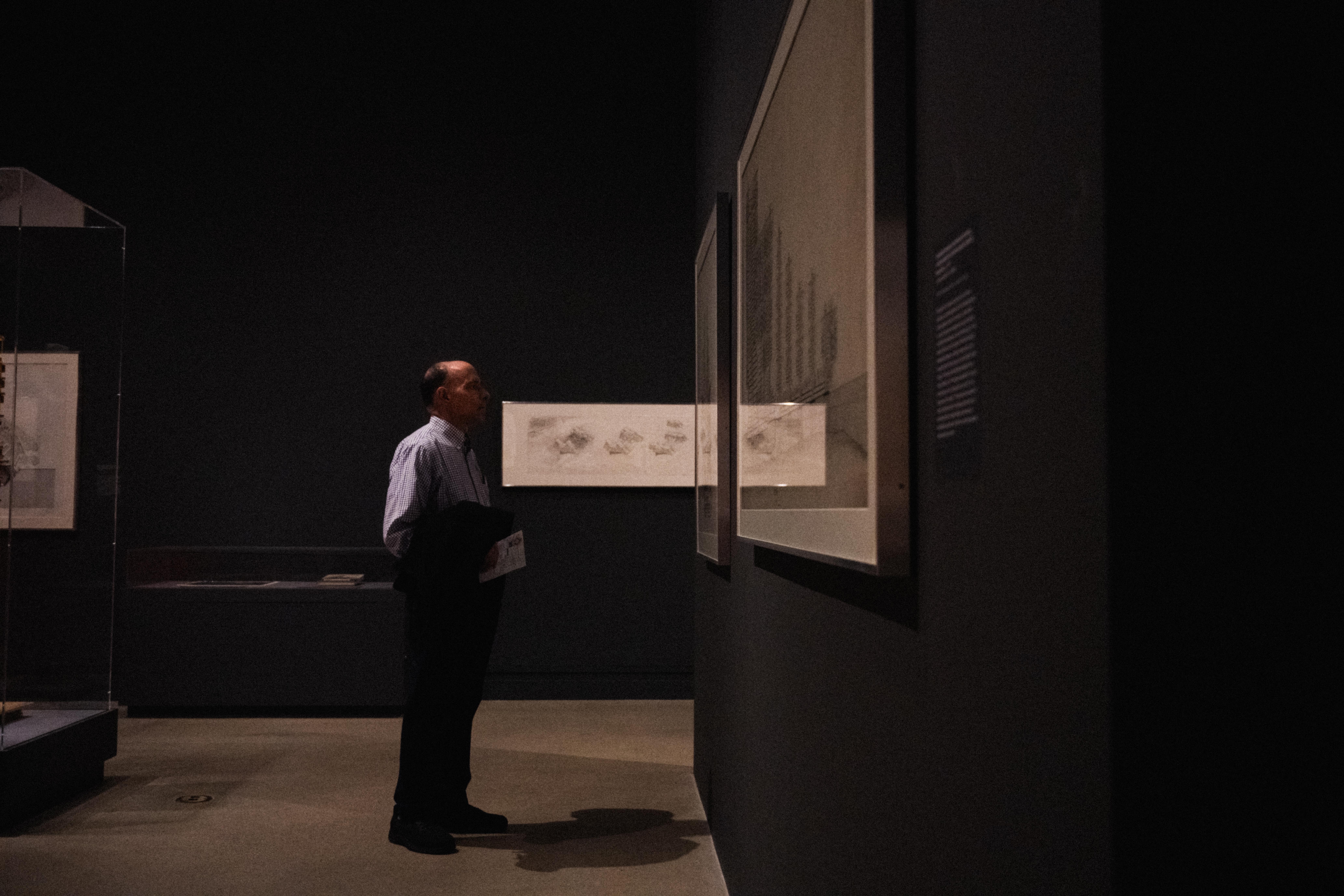
With each drawing and blueprint, architects usually include context and a description of the materials used to clarify their projects. In the MET’s exhibition, while there is contextual writing next to each of Rudolph’s drawings, materiality is neglected. How is the viewer meant to understand the true intended experience of the building if they don’t know what it is made of? In the large block of text on the wall at the entry of the exhibit, an overview of Rudolph’s life mentions that he often used concrete, leaving the average museum-goer brimming with questions: is every wall, floor, door, and staircase Rudolph designed made of concrete? The details of his material use are mostly left to the imagination.
Rudolph did love to incorporate reinforced concrete however the most interesting parts of his buildings are when he used thresholds and apertures in ways that transformed the idea of the open floor plan, which was overall left out by the MET’s exhibit. The Modulightor building was designed in a way that you can carry conversations with people through different floors of the building, with the speaker being on the sixth floor and listeners on the fifth and still being able to hear and see the speaker clearly.
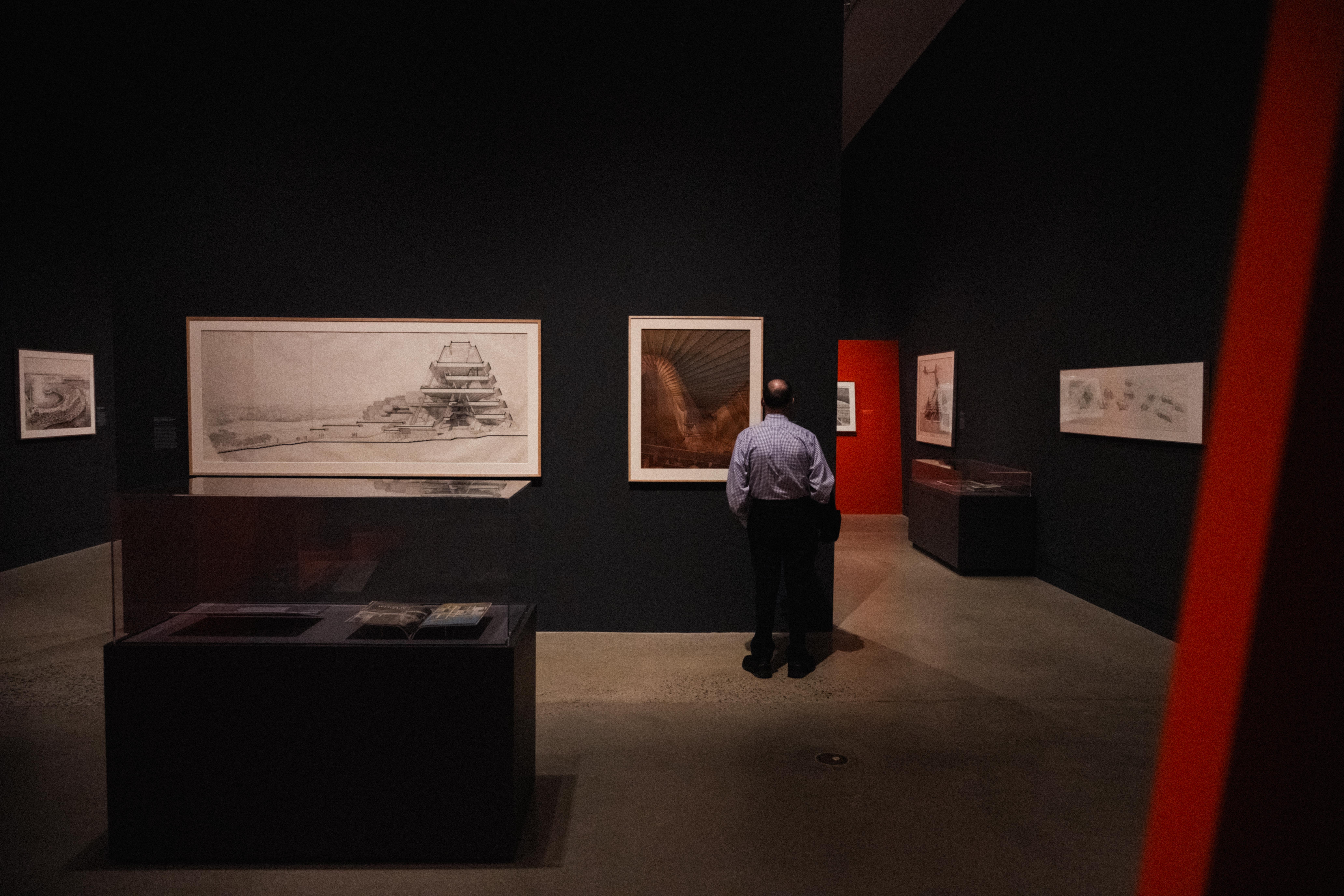
For how sprawling and prestigious Rudolph’s legacy is, the exhibit barely shows the variety of his works. Repetitive finished and inked drawings line the walls instead of the rough, unrefined, colorful sketches straight from Rudolph’s notebook that are showcased in the Modulightor building. Most if not all of the pieces displayed in the exhibit are on loan from the Modulighor building’s Paul Rudolph institute.
Solo-artist exhibitions are unique in that they have a chance to memorialize and immortalize the creative processes of singular artists. Of course, the final products are beautiful, but the public has seen the buildings Rudolph designed on the street and along their commutes to work. It’s his rough drafts and sketches that might reveal the wisdom and creativity of his design-riddled mind. One would hope this exhibit would show the creative side of being an architect, but unfortunately, it’s all too common to leave the artistry of architecture in the dust.
There’s a common misconception that the bulk of architecture is wrapped up in numbers and physics due to it being a field of Science, Technology, Engineering, and Mathematics (STEM). According to the Strengthening Career and Technical Education for the 21st Century Act, otherwise known as Perkins V, architecture is a STEM-related subject because of its inclusion of career and technical education (CTE) programs. Perkins V further promotes architecture in relation to STEM by encouraging the development of STEM-related career pathways that integrate technical and academic content while aiming to align with regional industry needs.
What’s missing from Perkins V is the reality that architecture isn’t solely floor plans and mathematics, it’s embracing surrealism and imagination. To get to the stage of producing elevations and scaled models, architects first must draw sketches, sculpt study models, and photograph perspectives. Even within modernism — Rudolph’s realm of expertise — creating something minimalist relies on the architect understanding the essential parts of a structure and utilizing creativity to make multi-functional pieces that do more with less material.
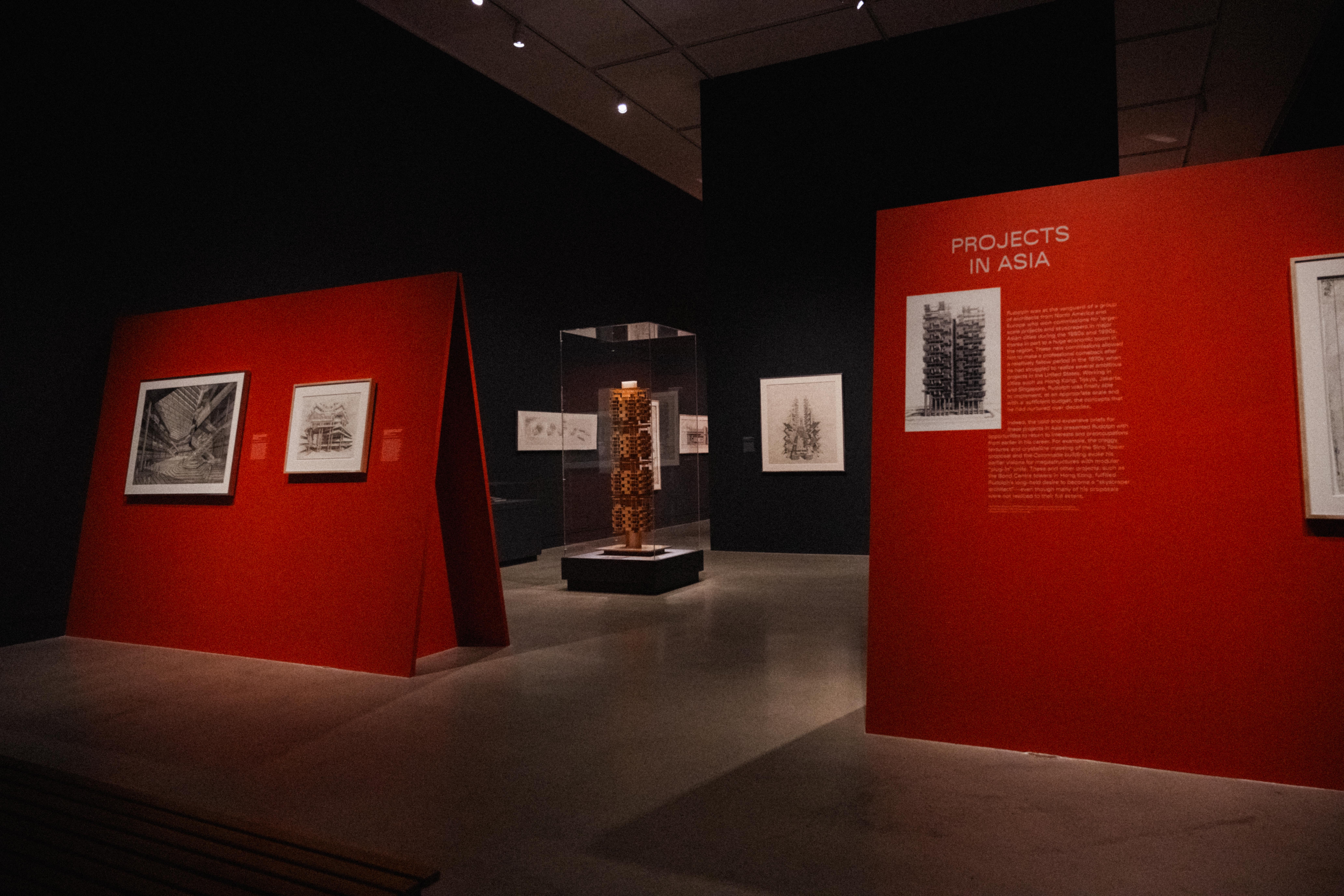
It’s unfortunate that even within one of the most internationally renowned houses of art, there was a negligence of creativity. Rudolph sketched and created blueprints not with equations and numbers, but with feelings and art. The studies of his buildings show a perspective of emotion, which was entirely left out of the MET’s exhibit.
Regardless of the museum’s execution, anything in association with Rudolph is hard to ruin completely. This exhibit shows some of his most well-known works along with some that were designed but never built, giving viewers that taste for something that could’ve been. However, in a museum with such a large budget, — approximately $357 million — and many other incredible exhibits which effectively transport visitors to a different era or place, this exhibit failed to perpetuate Rudolph’s impact on the world of architecture.




Leave a Reply